SAINT MARY’S GAELS Logo Redesign
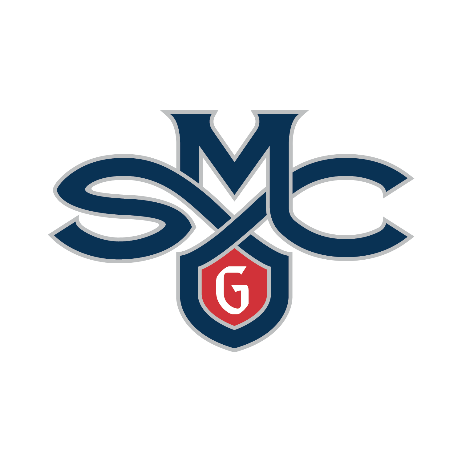
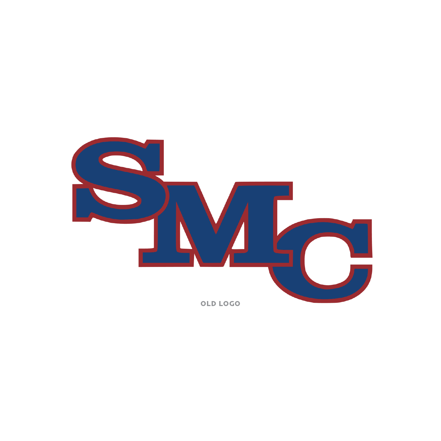
What is a Gael? That was the first question asked by many who are not familiar with the team or school. In the simplest terms, a Gael is an Irish person (the Irish speak Gaelic). The old logo had the acronym SMC in a very plain slab serif font with no character or hint of a Gael. With some research I took some of the characteristics of Gaelic/Irish type fonts and tied the letterforms with a decoration frequently used in the Irish knot. As a bonus the knot work created a shield to house the letter “G” for Gaels. Now the logo has a look and feel that is unique to its name and a warrior type emblem ready for battle on the sports field.


Art Director: Kurt Osaki
Designer: Gary Kohara